The purpose of a landing page is to provide a glimpse of the store’s offerings, captivating visitors and encouraging them to explore further. Its primary objective is to prompt visitors to take action, such as ordering a sample pack, subscribing to a product plan, or requesting more information.
It is noteworthy that visitors form an opinion about a landing page within a mere 0.05 seconds, and 38% of people will disengage from a website if the content or layout is unappealing. Therefore, effectively conveying the value proposition to viewers swiftly is crucial to avoid missed opportunities and potential customer loss.
In this article, we will explore twelve proven methods to optimize your product landing page, ensuring higher conversions and leaving a lasting impression of your brand and products.
What are the major components of a Product Landing Page?
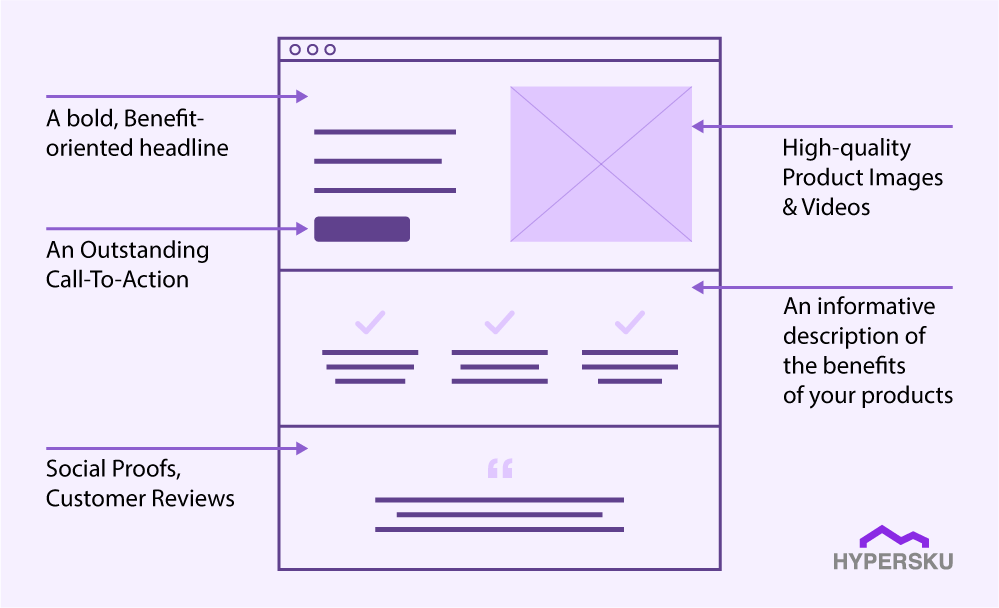
Presented below are the fundamental components that contribute to the exceptional performance of a landing page in terms of generating conversions:
1. Unique & Clear Headlines: The product headline serves as the initial point of contact for visitors to your storefront, offering a prime chance to captivate potential customers and pique their curiosity.
2. Captivating Product Image: Employ an attention-grabbing visual element or image that effectively communicates the essence of your product or service, compelling visitors to delve further into your landing page.
3. Persuasive Benefits: Clearly articulate the advantages and desirable outcomes that prospective customers can expect from engaging with your offering. Craft persuasive and concise statements that highlight the value you provide.
4. Inspirational Social Proof: Incorporate testimonials, reviews, or success stories from satisfied customers to bolster credibility and instill confidence in potential customers, reinforcing the value and trustworthiness of your brand.
5. Compelling Call to Action (CTA): Encourage visitors to take the desired action by employing a strong and compelling call to action. Make it clear, concise, and visually prominent, guiding visitors toward the next step in the conversion process.
The Top 12 Proven Tips On Product Landing Page Optimization
1. Clear and Benefit-oriented Headlines
Approximately 51.75% of visitors will bounce out from your e-commerce store without making a purchase, while the average e-commerce conversion rate is only 1.82%. Enhancing your chances of success can be achieved through a compelling product headline.
Headlines that focus on product features like “Durable Leather Backpack” or “Painted Notebook” miss the opportunity to communicate the benefits to the user. A benefit-oriented headline highlights how the product will enhance the user’s life, whether it’s creating an awesome atmosphere or becoming a better version of themselves.
Proven Tips:
a. Incorporate promotional information, such as “Buy One Get One Free” or “45% OFF.”
b. Include words like “New,” “Upgraded Version,” or the current year to create a sense of freshness and relevance.
c. Use appropriate descriptive words and highlight unique selling points to capture the attention of potential customers.
d. Use eye-catching icons or symbols to make the headline visually appealing.
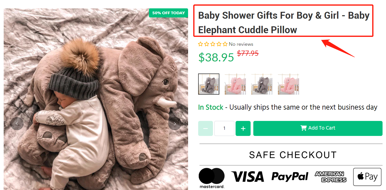
Look at this inspiring product landing page from Vixily for baby supplies. The catchy headline instantly tells you it’s suitable for baby shower occasions and bisexuals. The bold design hooks your attention incorporating the promotional 50% off on the top left, while the “Add To Cart” button is conveniently placed above the fold. No scrolling is required to make a purchase!
2. High-Quality Product Images/Visuals
As a dropshipper, capturing high-quality product images when you don’t physically store the items can be a challenge. While using images from your supplier’s website is the easiest option, it may not always be ideal when you are trying to scale your business and build your own brand. Poor image quality can negatively impact your business. To ensure the best representation of your products, it’s recommended to take your own images. Just order sample products, use a professional camera or high-end smartphone to capture images, and you’re all set.
Proven Tips:
a. Use the most visually appealing image, such as the best-selling variant of the product available in different colors.
b. Utilize dynamic images, such as GIFs, to demonstrate the key features of products that may not be immediately apparent
c. Ensure that the images align with the cover of your advertising materials to establish a sense of consistency and enhance customer trust.
d. Add instructional images, GIFs, or videos to guide users on product usage
3. Informative Product Description (Purpose+features+benefits)
When developing your product description, start by stating its purpose and features. Then, list the distinct benefits that address customer needs or market gaps.
The product description section provides product specifications and useful guides, including sizing charts and comparisons with other products offered by the company.
The product page’s features section should provide customers with information regarding available color options, models, and sizes. Additionally, it should highlight any technical or convenient features of the product.
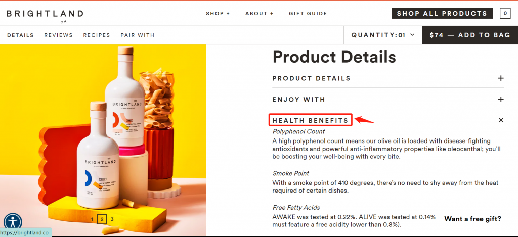
If you’re providing comprehensive information, you can add a toggle option, similar to Brightland’s olive oils, to highlight additional product benefits.
Proven Tips:
a. Include complete information about product dimensions and materials used.
b. Insert persuasive statements (e.g., “Sold 1000 units,” “Price increase imminent,” “3 days left for promotion,” “Second item at half price,” etc.).
c. Check for sensitive keywords (country names, brand names, etc.) and avoid their usage.
d. Embed well-performing social media posts within the landing page to enhance credibility.
4. Social Proofs/ Customer Reviews
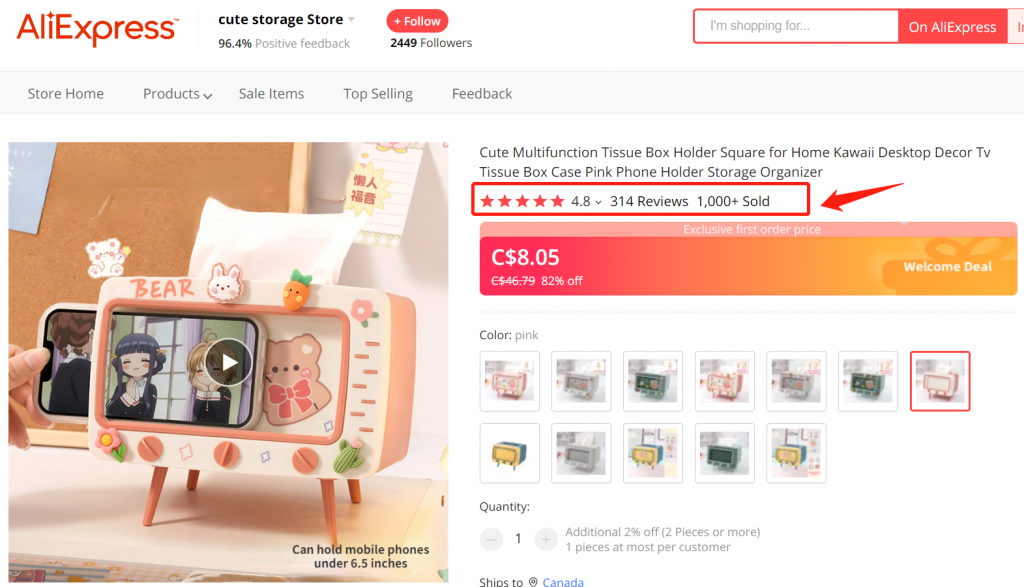
According to studies, 80% of American shoppers rely on recommendations when making a purchase. To convert visitors into customers, it’s crucial to showcase testimonials, reviews, ratings, and order numbers on your product landing page.
Take a cue from AliExpress, a platform that excels in this aspect. Here’s an example of an Aliexpress store:
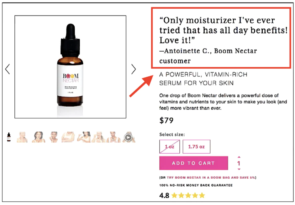
Another inspiring example of social proof, Ezra’s impactful modification to the buy boxes on his Shopify store involved replacing the item name with customer testimonials at the top. Here is what it looks like:
To enhance conversions, consider requesting customers to provide video reviews. According to Google, approximately 66% of shoppers attribute their purchase decisions to video reviews.
5. Multiple Attribute Settings
a. Provide necessary explanations after attribute labels, such as specifying the exact quantity in bundle sales.
b. Ensure comprehensive sizing information for clothing products and specify size conversions for different countries.
c. Boost trust by mentioning extended warranty terms in variant titles for electronic products
d. When attribute labels are concise, consider adding visually appealing icons.
6. Pricing Incentives or Promotions Strategies
- Buy 1 Get 1 (BOGO): This promotion is particularly suitable for frequently purchased or bulk items (e.g., dish detergent) as it provides a complimentary product or a discounted second product with each purchase. Implement bundled sales by combining multiple products to increase the average order value.
- Free Shipping: This offer can be an effective incentive, particularly when dealing with substantial shipping costs or when the product is large or cumbersome.
- Time-Sensitive Offers: Providing a limited-time special price creates a sense of urgency.
- Price products ending in “.99”: such as $29.99 or $39.99, to create a perception of a lower price.
- Price match guarantee: help boosts customer purchases by matching competitor’s prices.
- Utilize discount plugins: Like Ultimate Special Offers to enhance the visibility and effectiveness of promotions.
7. Create an Outstanding Call To Action
Landing pages that effectively convert ultimately rely on the call-to-action (CTA) button. The CTA button should be descriptive, action-oriented, and visually distinct from other elements on the page in order to capture attention.
Ensure that your customers have easy access to a CTA button throughout the entire page by implementing a double (or triple) CTA strategy. The first button is intended for visitors who are ready to proceed with their purchase. Incorporate an additional button for those who may be undecided and need more convincing to complete the checkout process, allowing them to proceed without having to scroll back up.
8. Suggest Similar Products
Provide recommendations for comparable products to assist the customer in narrowing down their search and exploring alternative options related to the item they are currently viewing.
Additionally, consider offering complementary items within a relevant product category based on the customer’s preferences or propose an upgraded version of the product as an upselling opportunity.
9. Policies and Conditions
- Clearly state the processing time for orders
- Specify the estimated shipping time
- Highlight your refund guarantee and return policy
- Provide contact information for customer inquiries
- Clearly mention the warranty period for products
10. Add a FAQ section
Adding a FAQ section to a product page is crucial as it enables businesses to proactively address potential customer questions and concerns, ultimately enhancing the overall shopping experience.
By anticipating and answering common inquiries before customers finalize their purchase, companies can instill confidence and trust in their products.
Here are some FAQs to include:
- What are the product specifications? (weight, dimensions, material)
- How do I use the product?
- When can I receive my package?
- What’s your return and refund policy?
- Is this product available in other specifications? (in different sizes, and colors)
11. Payment Methods
Offer a diverse range of payment methods to accommodate customer preferences. Ensure that popular options like PayPal and credit cards are securely integrated and functioning properly. Research the dominant payment methods used in the target sales countries to prioritize their implementation accordingly.
12. Speed Testing and Image Compression
Website loading speed directly impacts customer bounce rates. Utilize speed testing tools like Google PageSpeed Insights to analyze and optimize your website’s performance.
Additionally, compress images using tools such as ImageOptim to reduce file sizes without compromising image quality, thus improving overall page loading speed.

